Imagine crossing a busy road without being able to clearly see the curb or detect where the footpath ends.
For people who are blind or have low vision, this is a daily challenge. Designing safer, more accessible public spaces isn’t just good practice—it’s a social responsibility. That’s where Tactile Ground Surface Indicators (TGSI) and luminance contrast come into play.
Globally, there are well-established accessibility standards to ensure that built environments are safe and intuitive for all. Among the most effective tools for enhancing pedestrian safety for the vision-impaired are TGSI and high-contrast visual cues that signal transitions, hazards, and pathways.
Understanding the Needs of People with Vision Impairment
Contrary to popular belief, most people who are classified as legally blind still have some degree of vision. This makes visual cues, in combination with tactile and audible signals, highly effective in helping them navigate public spaces.
People with low vision rely on:
- Texture changes underfoot,
- Audible signals at crossings,
- And visual contrast to detect edges, steps, and pathways.
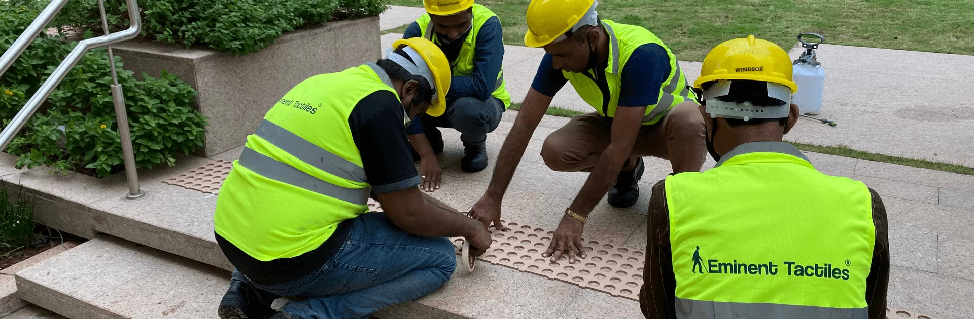
TGSI: More Than Just Dots on the Ground
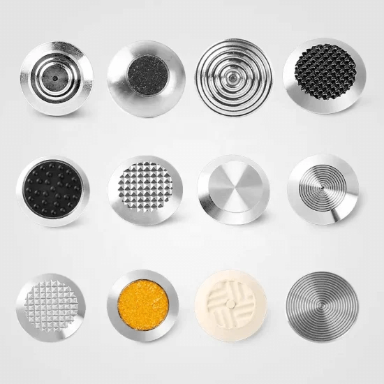
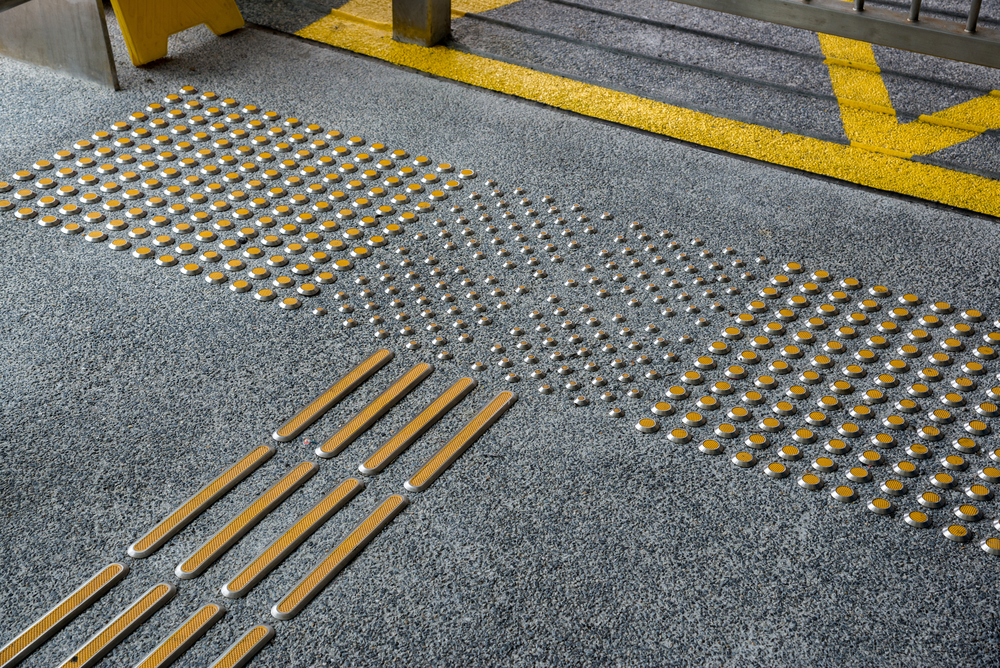
Tactile Ground Surface Indicators (TGSI) are textured tiles or surfaces that alert people with vision impairment to changes in the environment, such as approaching staircases, ramps, or intersections.
There are two primary types:
- Warning indicators (raised dots) to signal hazards like curbs or train platforms,
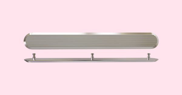
- Directional indicators (raised bars) to guide straight-line movement.
What Is Luminance Contrast and Why Does It Matter?
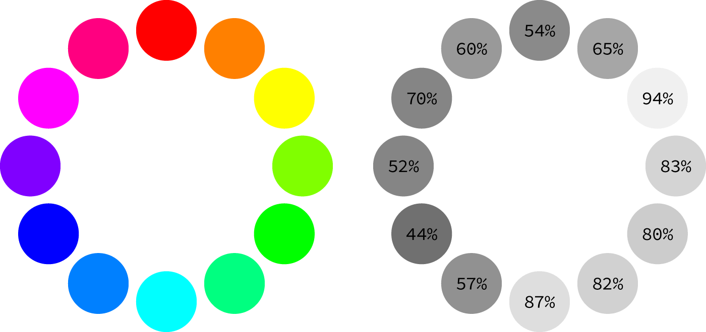
Luminance contrast (LC) refers to the difference in brightness between two surfaces. This contrast helps individuals with low vision distinguish between adjacent surfaces or features, especially in low-light or complex environments.
Australian and international accessibility standards recommend minimum LC values for critical areas such as:
- Stair edges: 50–75 mm nosing with at least 30% LC
- Doorways: 50 mm strip with 30% LC
- Tactile indicators:
- Integrated type: 30% LC
- Discrete single-colour: 45% LC
- Composite discrete: 60% LC
- Signboards: 30% LC against wall surfaces
- Lift buttons: 30% LC unless self-illuminated
- Toilet seats: 30% LC compared to background
How to Use Contrast and TGSI in Outdoor Design
When applied thoughtfully, luminance contrast and TGSI can dramatically improve outdoor navigation and safety for the vision-impaired. Here are some practical examples:
Mark Edges Clearly
Use a high-contrast strip (white or yellow) at the edge of curbs and steps to distinguish them from surrounding pavement.
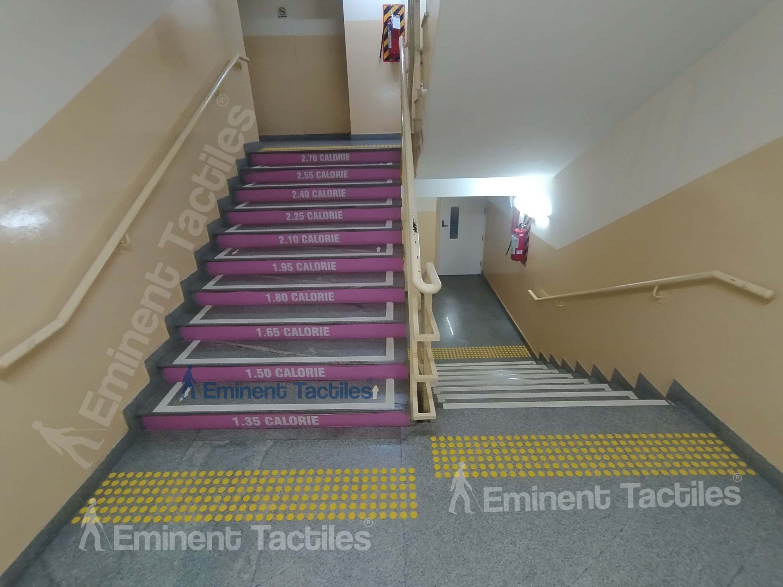
Highlight Staircases
Incorporate tactile indicators and luminance contrast at the top and bottom of staircases. Use textured stripes and contrasting colours for each step’s edge.
Light It Right
Improve lighting in key areas like pedestrian crossings, entrances, and ramps. Use ground-level LED lighting for extra visibility at night.
Combine Textures and Colour
Texture changes help signal transitions between walking zones, bike paths, and vehicle lanes. Use TGSI to separate these areas clearly.
Design for Shared Use Spaces
- Avoid overuse of textures where not needed
- Maintain clear, straight paths
- Install handrails and use visual/tactile cues around stairs and ramps
The Future of Inclusive Urban Design
As cities grow and populations age, the importance of accessible urban planning will only increase. Visual contrast and TGSI are not only essential for the blind and vision-impaired but also help children, older adults, and people with temporary impairments navigate safely.
Final Thought
Creating accessible environments isn’t a special requirement—it’s a basic human need. Incorporating tactile indicators and luminance contrast in urban planning is a small step with a massive impact.